What Is Data Visualization? Unveil Insights with Examples
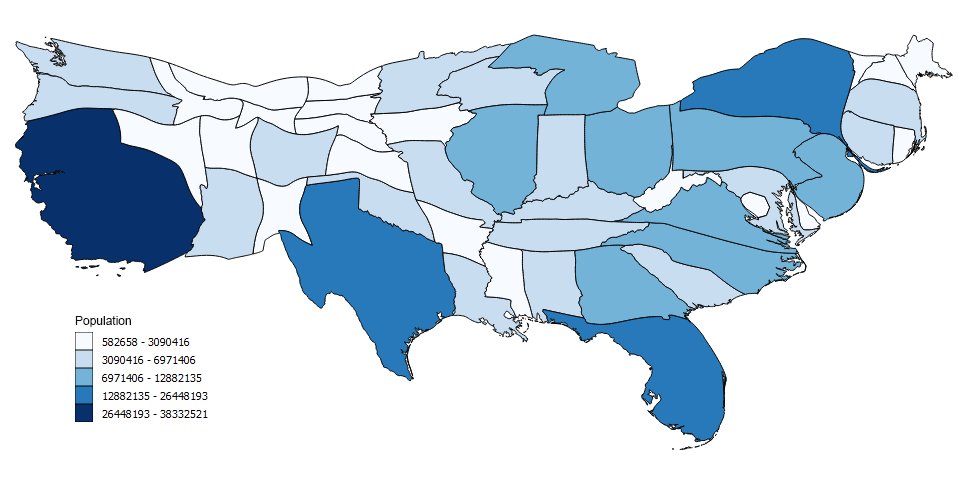
Understanding complex data can be challenging, but data visualization simplifies this by converting vast quantities of numbers into visual objects. By doing so, it allows for better pattern recognition, trend spotting, and data-driven decisions both in business and in scientific research.Visually compelling reports help stakeholders and decision-makers grasp subtle insights at a glance. As the […]