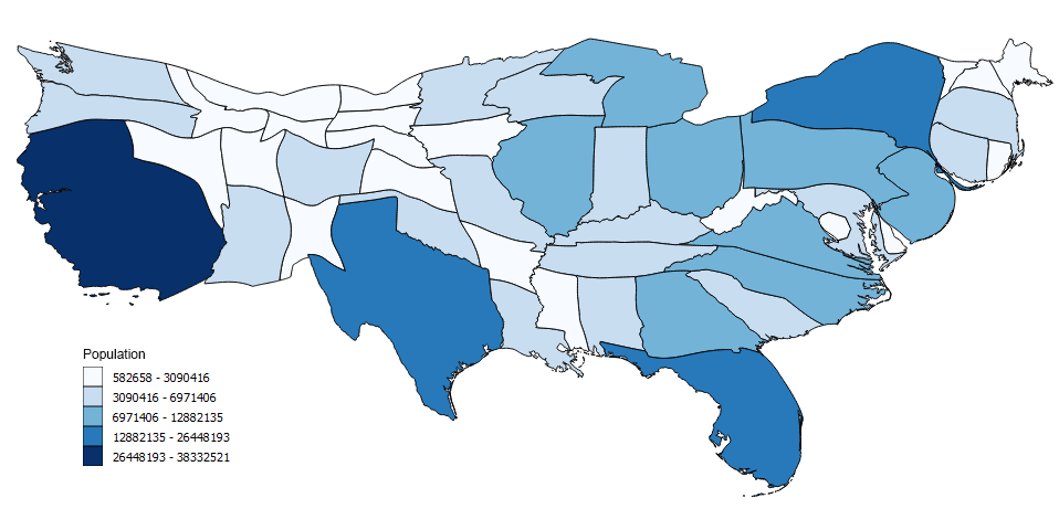
A Cartogram is a type of data visualization that uses graphical maps to represent statistical information. It is typically used to represent numerical information such as population density or other variables across a geographical area. Unlike traditional maps, a cartogram does not simply show geographic features such as rivers and cities, but instead uses the size of each region to represent the magnitude of its corresponding value. For example, in a population cartogram, larger regions would signify more people living in that area.
Uses of Cartogram
Cartograms are an effective way to visualize data because they offer an intuitive way to compare different values across a geographic area. By using the size of each region to indicate the intensity of its corresponding value, viewers can quickly discern differences between areas without having to read any text or tables of numbers. In addition, cartograms can be used to display changes in values over time by showing how regions grow or shrink according to the selected metric.
Cartogram Creation
To create a cartogram, one must first determine which variables they wish to map and what metric will be used for comparison (e.g., population density). Data points for each region are then gathered and plotted on a standard map using their respective coordinates. The size of each region is then adjusted according to its corresponding value so that it accurately reflects the difference between areas at-a-glance. Finally, adjustments must be made so that boundaries between regions remain recognizable while also accounting for any distortions created by changes in size.
Advantages of Cartogram
Cartograms offer many advantages over traditional maps when it comes to visualizing data and making comparisons across different regions or countries. They offer viewers an intuitive way to compare different values without having to read through tables or long descriptions and provide an accurate representation of changes over time – all while still keeping regional boundaries recognizable despite any distortions caused by adjusting sizes accordingly. As a result, cartograms have become increasingly popular for visualizing data related to topics such as politics, economics and demographics. Cartograms are used to represent data in a way that is visually appealing and can quickly communicate complex information. Cartograms is their ability to highlight trends and patterns that may not be apparent on other maps. For example, a population cartogram can show the largest populated areas in a country or region, providing insights on where people are concentrated. A cartogram of election results can show which political parties are strongest in certain regions and can highlight the differences between urban and rural areas. Another advantage of cartograms is their ability to express comparative data. A cartogram of the GDP of different countries can show which countries are the wealthiest, and how they rank in comparison to each other. This can help policymakers identify areas that need improvement, such as in investment or infrastructure.
Disadvantages of Cartogram
However, cartograms also have some disadvantages. One of the main criticisms of cartograms is their potential for distortion. Because cartograms are based on the manipulation of geographic area, it is possible for the map to be manipulated to visually emphasize certain points or trends, which may be misleading or inaccurate. Additionally, cartograms can be difficult to produce and interpret if the data is complex or if the variables used are not well-defined. Cartograms are also not always well-suited for displaying information that includes small or irregularly-shaped geographic areas.
Conclusion
In conclusion, cartograms are a useful tool for visually representing complex information in a way that is easy to read and interpret. However, their limitations must be taken into account when interpreting the data presented. Overall, cartograms can be a valuable resource in the fields of politics, economics, and sociology, offering insights into regional trends and patterns that are not easily discernible on other types of maps.