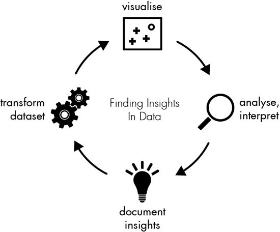
Understanding complex data can be challenging, but data visualization simplifies this by converting vast quantities of numbers into visual objects. By doing so, it allows for better pattern recognition, trend spotting, and data-driven decisions both in business and in scientific research.
Visually compelling reports help stakeholders and decision-makers grasp subtle insights at a glance. As the digital universe expands, the visualization tools and techniques evolve, continuously transforming big data into intelligible stories. This process not only aids comprehension but also enhances the capacity to share concise, impactful narratives through data. Effective data visualization is crucial in a world where data is continuously growing in importance and volume.
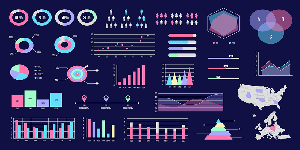
The Power Of Data Visualization
The Power of Data Visualization is undeniable in today’s information-rich world. Complex data sets become clear stories with effective visualization tools. It transforms raw data into compelling visuals that reveal insights and patterns.
Connecting Dots Between Data And Decisions
Data visualization serves as a bridge between intricate data and strategic decisions. Managers and analysts often sift through vast quantities of numbers. This can be time-consuming and confusing. But, with charts, graphs, and maps, data becomes digestible. Tables compare numbers effectively. Bullet points simplify complex ideas. Here’s why data visualization is indispensable:
- Quick Analysis: Visuals allow for rapid understanding of trends and patterns.
- Better Communication: Graphs and charts communicate findings clearly to any audience.
- Identifying Correlations: Visual diagrams show how different data points relate.
- Efficient Reporting: Interactive dashboards provide real-time data analysis.
Why Visuals Can Say More Than Raw Data
- Pie Charts: They illustrate proportions within a whole.
- Line Graphs: These show changes over time.
- Heat Maps: They highlight density and clustering.
- Bar Graphs: These compare quantities among different groups.
Key Principles Of Effective Data Visualization
The Key Principles of Effective Data Visualization serve as essential guidelines to present data in clear, insightful ways. These principles transform raw data into a story that speaks to the audience succinctly and persuasively. Now, let’s dive into the core aspects of data visualization excellence.
Clarity And Comprehensibility
Design Elements: Color, Scale, And Form
- Scale should reflect accurate proportions, making comparisons meaningful and intuitive.
- Form is about selecting the right type of visualization for your data. Pie charts are great for parts of a whole, while line charts are perfect for trends over time.
Element
Best Practice
Color
Use color to categorize, differentiate, and signify importance, but don’t overdo it.
Scale
Reflect true proportions, and make axis graduations clear and consistent.
Form
Choose the right type of visualization to convey your message with accuracy.
Tools And Technologies In Data Visualization
The landscape of data visualization is vast and filled with diverse tools and technologies. These instrumental tools convert raw data into visual contexts, such as graphs and maps, to help people understand the intricacies of data through patterns, trends, and correlations. Let’s dive into the specifics of software and online platforms available and discuss how to select the perfect tool for your data needs.
Software And Online Platforms
- Tableau: One of the leaders in the visualization field, offering powerful analysis features.
- Microsoft Power BI: A suite of business analytics tools to analyze data and share insights.
- Qlik Sense: A platform for self-service data visualization and guidance-driven analytics.
- Google Data Studio: A free tool that turns your data into informative, easy to read, easy to share, and fully customizable dashboards and reports.
Many platforms are available, ranging from open-source solutions like R and Python with libraries such as Matplotlib and Seaborn, to enterprise-level systems like SAS Visual Analytics. These platforms offer different levels of customization, complexity, and cost.
Choosing The Right Tool For Your Data
Selecting the right visualization tool can be a challenge. Consider these factors:
Data Type
Quantitative, Qualitative
Nature of Task
Reporting, Exploration
User Experience Level
Beginner, Expert
The goal of your analysis, the size and type of your dataset, the skills of the team, and the level of interactivity required will all influence your choice. For simple tasks, tools like Excel might suffice. Complex data might need a more sophisticated platform such as Tableau.
Always test multiple tools with your data. Many offer free trials or community editions. This hands-on approach ensures you find a tool that fits your data and your team’s workflow.
Types of Data Visualizations
The realm of data visualization is rich and varied. It brings complex data to life, making it easy for users to understand patterns and insights at a glance.
From Pie Charts To Heat Maps
Data visualization comes in various forms, each designed to highlight different aspects of data. Some popular types include:
- Pie Charts: Represent proportions within a whole.
- Bar Graphs: Compare quantities across different categories.
- Line Graphs: Show trends over time.
- Scatter Plots: Reveal relationships between two variables.
- Heat Maps: Use colors to represent data values in a matrix.
Interactive Visualizations And Dashboards
Interactive visualizations and dashboards take data analysis a step further. They allow users to:
- Drill Down into the details.
- Filter information to see what’s relevant.
- Customize views according to specific needs.
Examples of interactive tools include:
Tool Type
Business Intelligence (BI) Platforms
Web-based Dashboards
Use Case
Transform large datasets into actionable insights.
Monitor real-time data in a centralized location.
These dynamic visualizations are not just static images. They are powered by technology to create an engaging user experience.
Case Studies : Data Visualization in Action
Data visualization breathes life into raw numbers and abstract stats. It transforms complex data sets into clear visuals. Let’s dive into real-world case studies showcasing the power of data visualization.
Visualizing Public Health: Tracking Epidemics
Data visuals have proven vital in public health. They track disease spread and measure impacts. The COVID-19 pandemic is a prime example.
- Interactive maps showed cases and recoveries.
- Graphs compared infection rates across regions.
- Charts analyzed vaccine rollouts.
Institutions like the CDC utilized dashboards. They made data accessible for health experts and the public alike. These tools have been crucial for decision-making and awareness.
Business Intelligence: Making Sense of Market Data
Companies use data visualization to understand markets. It turns sales stats and customer info into visuals. This helps businesses spot trends and make smart choices.
Here’s how market data comes alive through visualization:
Visualization Type
Pie Charts
Line Graphs
Heat Maps
Use Case
Market share analysis.
Sales trends over time.
Regional sales performance.
Through the use of bar graphs, scatter plots, and more, organizations distill vast arrays of data into actionable insights.
Best Practices For Creating Meaningful Visualizations
Data visualization is an essential skill in the digital age. To unlock the true potential of data, you need to present it in a clear, visually engaging manner. This means that you need to follow certain best practices to create meaningful visualizations that not only convey data but also tell a story. Whether you are a data scientist, marketer, or someone just looking to present information effectively, these practices are crucial.
Know Your Audience
Understanding who will be interpreting your data visualization is key. Not all audiences have the same level of data literacy. Tailoring your visualization to the knowledge level and interests of your audience ensures that your message is received and understood. For example:
- Experts might prefer detailed, complex visualizations.
- General audiences need simpler graphics with clear takeaways.
Storytelling With Data
Good data visualization tells a story, taking the viewer on a journey through the information. Craft your visuals to have a narrative arc, with a clear beginning, middle, and end. This approach helps to keep the audience engaged and makes the data more memorable. Use sequential elements like:
- Introduce the topic.
- Present the problem or question.
- Show the data that provides insights.
- End with a conclusion or call to action.
Element
Title
Legend
Axis Labels
Data Points
Narrative
Description
Should be informative and grab attention.
Key to understanding the symbols and colors used.
Clarify what each axis represents.
Must be accurate and clearly marked.
Explains the story within the data.
By following these best practices and using tools like charts, graphs, and interactive interfaces, your visualizations will not only be attractive but also meaningful and effective.
Conclusion
Data visualization opens doors to clearer understanding and efficient communication of complex information. It transforms raw data into compelling visuals that resonate with audiences. Armed with examples we’ve explored, you’re poised to harness this powerful tool. Embrace data visualization and watch your insights come to life.