A box-and-whisker plot, also known as a boxplot, is a useful graph used to visually summarize and compare sets of data.
Uses of Box-and Whisker Plot
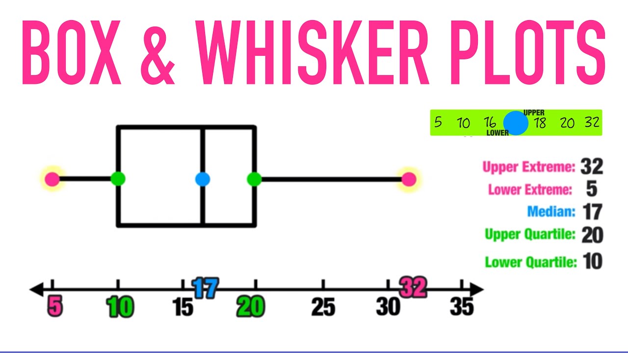
It is typically used to represent the distribution of quantitative data, such as a sample size or population. The box in the box-and-whisker plot represents the middle 50% of the data, while the whiskers reach out to include all values within 1.5 times the interquartile range (IQR) of either side of the median value. The boxplot is often used to illustrate the spread and variability of data points that are not necessarily normally distributed.
The three quartiles divide the data into four equal parts, with each part representing 25% of the entire dataset. The top and bottom lines on each side represent what are called minimums and maximums – these are values that fall outside of the IQR from either end of the selected percentile range. Outliers may appear as points outside this region and can be easily identified by simply looking at where they lie relative to other points on the plot.
Boxplots can also be used to compare different datasets in terms of their spread and central tendency by plotting them side by side. This provides an efficient way to visualize how two sets may differ in terms of shape and overall variability. Additionally, it is easy to look for any obvious trends between multiple datasets when represented in this manner.
Combination with other Plots
Boxplots are often combined with other plots such as histograms or scatterplots in order to gain additional insight into a given dataset; this allows us to examine both distributions within our data simultaneously as well as identify any relationships between two variables that may be present. For example, if we were looking at how an investment portfolio has performed over time, we could use a scatterplot to show changes in returns versus risk over time and then supplement this with a boxplot for each month or year so that we could easily visualise any outliers or areas where there was unexpected behaviour from our investments compared to previous periods.
Advantages and Disadvantages
This type of plot has several advantages, including its ability to show the distribution of the data, identify outliers and skewness, and compare multiple groups simultaneously. Additionally, box plots can handle large datasets and are particularly useful for visualizing data that does not have a normal distribution or when comparing datasets with different sample sizes.
However, box-and-whisker plots also have some limitations. One disadvantage is that they don’t show the actual values of the data points, only their distribution. This can make it difficult to interpret the exact values of the data or identify specific trends within the dataset. Additionally, box plots can be misleading when the data is not symmetric, particularly when the median and mean diverge significantly. Finally, box plots can also be difficult to read for individuals who are unfamiliar with the concept, causing potential misinterpretation of the data. Overall, while box-and-whisker plots are a useful tool for analyzing numerical data, they should be used in conjunction with other statistical methods to gain a more thorough understanding of the data. By considering both the advantages and disadvantages, researchers can make more informed decisions when selecting visualizations to represent their data.
Overall, box-and-whisker plots provide valuable information about a dataset by illustrating its shape and spread quickly without losing too much detail or context about individual observations; this makes them extremely helpful when comparing multiple datasets or when analysing large amounts of quantitative data at once!